Monday, October 20, 2014

Make It Count


Today, the first impression is made in under five seconds and focuses on the sense of sight as buyers scour the web looking at properties.  Clear visually attractive photos have the greatest chance of grabbing a buyer’s attention long enough for them to develop interest in finding out more.  The whole point of the MLS is to get a prospective buyer through the front doors.

As the digital age has transformed photography, so too has it transformed real estate listings.  Today everyone who has a smart phone has a digital camera and the capability to upload those photos immediately to the web.  But, if the purpose of the real estate photos is to attract prospective buyers, how much is a bad photo costing you?  Poor photography is really worse than no photo.  A property that does not show well on the internet is often skipped and gets no foot traffic.   

In addition, when a listing goes live, it is pushed to many other sites, like Zillow.com, Redfin.com, Trulia.com and Realtor.  If there are poor quality cell phone images, those are the images that get sent to prospective buyers.  Even if better photos are added shortly after, the first photos won’t go away and will hurt your marketing efforts.  It is worth a few extra days and dollars to make the best possible impression.

The difference can be quite dramatic between a professional photograph and an amateur one. Lighting, quality equipment and proper training all factor in to create a perfect image.  Professional photography is quite affordable.  A package of 15 photos that include the interiors and exterior will run about $150 to $250 (it varies depending on the size of the house and location). 

Take the time to make sure the house is clean and clutter free before scheduling a photo shoot.  You want the photos to show your listing to the best advantage.  A little extra prep time and you are on your way to getting qualified buyers to come through the door. 


Saturday, October 4, 2014

AIARE Design Awards 2014


Last night's 2014 AIARE Design Awards was molto bene! Thanks to the Design Awards committee and congratulations to all the winners! There are lots more photos.

Thursday, November 14, 2013

House Tour of Christopher Alexander Designed Home


Tour led by Architect Demetrius Gonzalez and Contractor David Leff
Hosted by Heidi Faulkner, Sotheby’s Realty

This magnificent artisan estate was designed by renowned architect Christopher Alexander whose talent created a masterpiece of profound beauty in Sebastopol.  The home uses passive solar design and its thick walls are built of shot-crete. The house is designed to last for several hundred years.  Recycled and sustainable materials were used as much as possible throughout the house. The wood floors in the living room are made of recycled mahogany from crates used by Sunkist to bring tuna to California at the turn of the 20th century, and the upstairs floors are made from old-growth redwood from chicken coops in Petaluma. Beautiful cabinets in the gourmet kitchen and the stairway are made from a sustainable form of eucalyptus. The redwood on the outside of the office wing came from an old farmhouse built in the 1880’s. Most of the other floors are acid etched concrete with radiant heat.

This project is a good example of the ideas that Christopher Alexander wrote about in his books on architecture.  Christopher Alexander studied at Berkeley in the 60’s and wanted to find a different way of “procuring” architecture.  He found a great lack of feeling in the designs at the time.  He wrote several books, including a four volume opus, “The Nature of Order”.  He had a theory that there is an objective source of beauty.  That source is the interconnectedness of everything. He strived to create that feeling of unfolding life. The motivation behind the design of this house was to create something of deep feeling that enlivens people.  There is certain geometry that does that and it comes from nature and certain traditional cultures.

In addition to Christopher, the project team included architect Demetrius Gonzalez who worked with Christopher and was the project manager and David Leff of Leff Construction who was the general contractor on the project.  Demetrius connected with Christopher fairly early and worked with him in London and then back in Berkeley and on this project.

Beauty, functionality and good stewardship of the land are all part of philosophy behind the house and the gardens.  The house sits high upon an east facing ridge and has sweeping views of vineyards and redwood forests that lead the eye across the Sonoma Plain to the Mayacamas and Sonoma Mountains toward Napa. It is a seven acre garden sanctuary which uses a sustainable and ecological approach, called permaculture, to grow heirloom fruit, berries and lavender.  See the photo gallery for more photos of this beautiful home.

Friday, October 18, 2013

Fall Color

I attended a tour and lecture of Permaculture's farm and test gardens in Sebastopol recently.  The US Green Building Council organized the meeting and even though it was mid-October, there was still a profusion of plants and flowers still thriving.  As the evening progressed, we were treated to a beautiful sunset lighting the few clouds in the sky.


Thursday, January 10, 2013

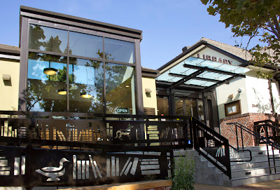
Claremont Branch of the Berkeley Library

The Tudor-style building at 2940 Benvenue Avenue in Berkeley was opened ceremoniously by Berkeley Mayor Frank D. Stringham on the evening of October 27, 1924. The library was designed to blend in both scale and character with the beautiful homes around it. James W. Plachek, who also designed the Berkeley Central building downtown, gave the library an Old World charm still apparent today.

Artists, writers, musicians and political activists among others, have been attracted to the Elmwood neighborhood since the first homes were built in the early 1900’s.  The name "Elmwood" first appeared in a 1905 promotional real estate brochure extolling its bucolic charms and its wide unpaved avenues of elms and poplars. Today anyone living within easy walking distance of the shopping district at College and Ashby Avenues is part of this pedestrian-friendly neighborhood.

Renovated and improved, the Claremont Branch is poised to serve future generations with updated and state-of-the-art spaces that are inviting, efficient, and flexible. The renovation and improvements were completed as part of the Branch Library Improvement program that began in 2009. Funds from a $26 million bond measure will bring all four branches up to current code standards. The renovated branches will meet current seismic requirements, be fully ADA accessible and provide environmentally sustainable “green” operations.
The new addition and entrance.  For a slide show click here.
The new addition and entrance.  For a slide show click here.

Friday, September 7, 2012

Sunset Breezehouse

For a slide show of the interiors, click on the photo above.


By Jordan Lebovich, JBL Photography

For the 2012 Sunset Magazine Idea House, Sunset Magazine and Blu Homes teamed up to create a spacious, updated Breezehouse, built in Blu Home’s state-of-the-art factory in Mare Island.  The home arrived in three trucks and the panels were then assembled on-site in Healdsburg on a steep lot that over-looks the wine country. Unbelievably the house was installed in only a day and a half and then finished in about a week.

Of course the site engineering and preparation took several weeks, but once the foundation was ready it was quick work.  The Breezehouse is a modular home that seamlessly blends indoor living with the outdoors and provides a stunning environment that is healthy, energy-efficient, and well constructed.  Since the house is precision built to local and state codes at the factory, onsite inspection times are shorter and there is less impact to a city’s resources. 

Some of the environmentally friendly features include:
  • Built in a controlled setting with faster construction time
  • Steel framing is recycled up to 90% 
  • Batt insulation is recycled up to 80%, with no phenol, formaldehyde or acrylics used
  • Low VOC (volatile organic compounds) paints
  • Reclaimed wood or bamboo floors
The home features two bedrooms, a guest bedroom/office and three bathrooms as well as a separate in-law unit or Breeze Pod.  There is lots of storage space throughout the house.  For a factory built home, the house is beautiful and pretty amazing.  Blu Homes is a San Francisco and Boston-based company founded out of a research project by MIT and the Rhode Island School of Design to transform the way pre-fab homes are built. They use technology to help revolutionize the way that green homes are built.  For floor plans, a virtual tour and more information go the Sunset Magazine Breezehouse Idea House page.